The feedback on our DVD cover was mixed in places. Some of our audience liked how it was plain and simple it was on the back and some thought the front was to plain as well. However, this was the style we were going for to try and successfully promote the music video. Many of the criticisms were that there was not enough going on in the front of the cover.
We then got told that the card board background for the title of ‘Forest of Morals’ has to be took as a original picture because of classed as ‘cheating’ by taking something from the internet.

The audience really liked the inside of the cover due to the picture we used in the background. The image is very random but gets the point across that it is a different band as it’s characterised as indie. The picture is of Clive McPhee’s feet in the mud whilst we were filming the performance base scene in the Quarry in the morning.
The background of Clive’s feet made the writing hard to see because there is a lot going on in the background image. We were advised to take another image to make the writing more clear or put a cast shadow on. The cast shadow would work but didn’t change a great deal in it. So we changed the font and the boldness of the writing so it is clearer for the final cut. The audience then criticised the size of the bands title ‘Forest of Morals’. The letters weren’t big enough to stand out so we had to cut down the white background from the letters to make the letters standout more and catch the eye of the target audience. We then decided to put a ‘Forest of Morals’ tour on the bottom right to make it more exciting and realistic.
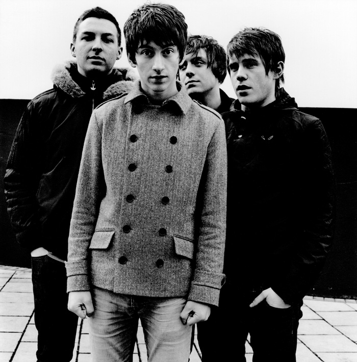
The audience then criticised the images of the band on the bottom left of the inside of the DVD cover. This was because of the poor visibility of the images because all of the images were edited too much and made it difficult to see the band. Also we were missing one of the band members and the audience realised this.
We had the same problem with the background image because it was severely edited and made it very difficult to read the writing, so we cut down the saturation and the contrast so the writing is more visible and more understandable.
The audience didn’t like the font of the ‘Pretty Visitors’ writing because it was to original so changed it to make it stand out some more and link in with the genre of music.

No comments:
Post a Comment